Qantas VR Training App
App User Interface Design
As part of VR Learn Piece of Concept development, Panedia ask me to design an appealing User Interface for the companion app that is triggering the Virtual Reality training system.

In this case we are starting with a pilot program for Qantas with 2 different User Interface components:
- Companion App
- VR Player and Assessment Program
VR Learn Player

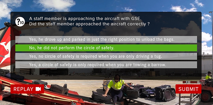
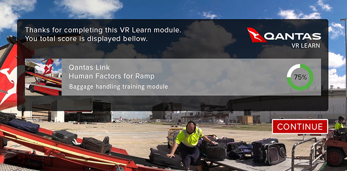
After selecting a training module the user is safely placed in the virtual training environment watching a 360 video and analysing the scene. Once there is subjected to a number of questions on which will be later assessed and receive a score.
Based on the questions’ requirements I have developed a number of different screens that the trainee will use until reaches the end of the VR training module and land back on the companion app interface.