VR Learn App
User Experience Design
Following the Qantas User Experience Design, VR Learn was in need of a Demo App to showcase potential clients and investors. So I focused on partially transposing the Qantas VR Learn App to VR Learn.
- Mainly keep it simple, with clean looks and easy to use.
- With a graphic layout that can be easily adaptable to different clients and integrates with their signage/colors.
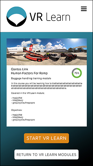
I have manage to produce a vibrant but user friendly design that is flexible and at the same time pretty straightforward. Integrates as choice of:
- Color base background integrated with client’s logo/corporate image color scheme
- Significant image background integrated with client’s logo/corporate image color scheme.